
r语言ggplot2误差棒图快速指南
本文展示了如何基于ggplot2绘制误差棒图。
可下载资源
给直方图和线图添加误差棒
准备数据
这里使用ToothGrowth 数据集。
library(ggplot2)
df <- ToothGrowth
df$dose <- as.factor(df$dose)
head(df)
## len supp dose
## 1 4.2 VC 0.5
## 2 11.5 VC 0.5
## 3 7.3 VC 0.5
## 4 5.8 VC 0.5
## 5 6.4 VC 0.5
## 6 10.0 VC 0.5
len :牙齿长度dose : 剂量 (0.5, 1, 2) 单位是毫克supp : 支持类型 (VC or OJ)
在下面的例子中,我们将绘制每组中牙齿长度的均值。标准差用来绘制图形中的误差棒。
首先,下面的帮助函数会用来计算每组中兴趣变量的均值和标准差:
#+++++++++++++++++++++++++
# Function to calculate the mean and the standard deviation
# for each group
#+++++++++++++++++++++++++
# data : a data frame
# varname : the name of a column containing the variable
#to be summariezed
# groupnames : vector of column names to be used as
# grouping variables
data_summary <- function(data, varname, groupnames){
require(plyr)
summary_func <- function(x, col){
c(mean = mean(x[[col]], na.rm=TRUE), sd = sd(x[[col]], na.rm=TRUE)) } data_sum<-ddply(data, groupnames, .fun=summary_func, varname)
data_sum <- rename(data_sum, c("mean" = varname))
return(data_sum) }统计数据
df2 <- data_summary(ToothGrowth, varname="len", groupnames=c("supp", "dose")) # 把剂量转换为因子变量
df2$dose=as.factor(df2$dose)
head(df2)
## supp dose len sd
## 1 OJ 0.5 13.23 4.459709
## 2 OJ 1 22.70 3.910953
## 3 OJ 2 26.06 2.655058
## 4 VC 0.5 7.98 2.746634
## 5 VC 1 16.77 2.515309
## 6 VC 2 26.14 4.797731
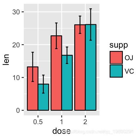
函数 geom_errorbar()可以用来生成误差棒:
library(ggplot2) # Default bar plot
p<- ggplot(df2, aes(x=dose, y=len, fill=supp)) + geom_bar(stat="identity", color="black", position=position_dodge()) + geom_errorbar(aes(ymin=len-sd, ymax=len+sd), width=.2, position=position_dodge(.9))
print(p) # Finished bar plot
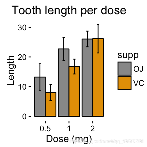
p+labs(title="Tooth length per dose", x="Dose (mg)", y = "Length")+ theme_classic() + scale_fill_manual(values=c('#999999','#E69F00'))


你可以选择只保留上方的误差棒:
# Keep only upper error bars
ggplot(df2, aes(x=dose, y=len, fill=supp)) + geom_bar(stat="identity", color="black", position=position_dodge()) + geom_errorbar(aes(ymin=len, ymax=len+sd), width=.2, position=position_dodge(.9))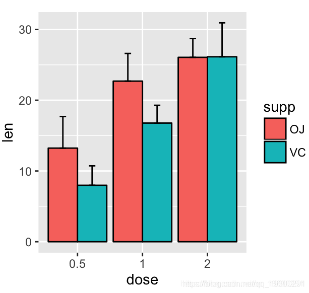

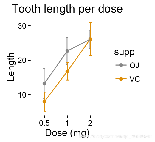
有误差棒的线图 # Default line plot
p<- ggplot(df2, aes(x=dose, y=len, group=supp, color=supp)) + geom_line() + geom_point()+ geom_errorbar(aes(ymin=len-sd, ymax=len+sd), width=.2, position=position_dodge(0.05))
print(p)
# Finished line plot
p+labs(title="Tooth length per dose", x="Dose (mg)", y = "Length")+ theme_classic() + scale_color_manual(values=c('#999999','#E69F00'))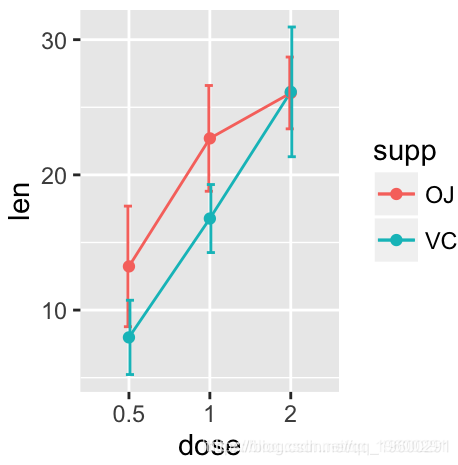


你也可以使用函数 geom_pointrange() 或 geom_linerange() 替换 geom_errorbar()
# Use geom_pointrange
ggplot(df2, aes(x=dose, y=len, group=supp, color=supp)) + geom_pointrange(aes(ymin=len-sd, ymax=len+sd))
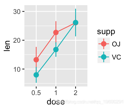
# Use
geom_line()+geom_pointrange()
ggplot(df2, aes(x=dose, y=len, group=supp, color=supp)) + geom_line()+ geom_pointrange(aes(ymin=len-sd, ymax=len+sd))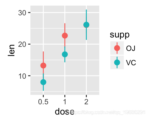


有均值和误差棒的点图
使用函数 geom_dotplot() and stat_summary() :
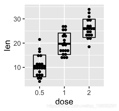

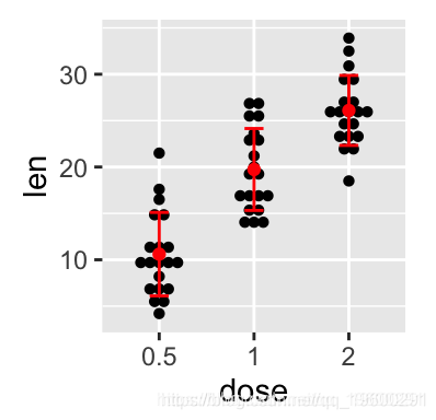

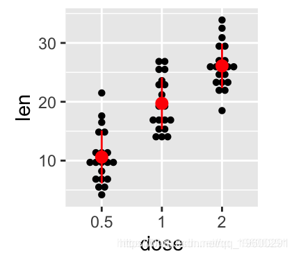

The mean +/- SD can be added as a crossbar , a error bar or a pointrange :


p <- ggplot(df, aes(x=dose, y=len)) + geom_dotplot(binaxis='y', stackdir='center')
# use geom_crossbar()
p + stat_summary(fun.data="mean_sdl", fun.args = list(mult=1), geom="crossbar", width=0.5)
# Use geom_errorbar()
p + stat
_summary(fun.data=mean_sdl, fun.args = list(mult=1), geom="errorbar", color="red", width=0.2) + stat_summary(fun.y=mean, geom="point", color="red")
# Use geom_pointrange()
p + stat_summary(fun.data=mean_sdl, fun.args = list(mult=1), geom="pointrange", color="red")
可下载资源
关于作者
Kaizong Ye是拓端研究室(TRL)的研究员。在此对他对本文所作的贡献表示诚挚感谢,他在上海财经大学完成了统计学专业的硕士学位,专注人工智能领域。擅长Python.Matlab仿真、视觉处理、神经网络、数据分析。
本文借鉴了作者最近为《R语言数据分析挖掘必知必会 》课堂做的准备。
非常感谢您阅读本文,如需帮助请联系我们!
 R语言绘制ggplot2双色XY-面积图组合交叉折线图数据可视化
 R语言ggplot2绘制Kolmogorov-Smirnov KS检验图ECDF经验累积分布函数曲线可视化
 R语言GGPLOT2绘制圆环图雷达图/星形图/极坐标图/径向图Polar Chart可视化分析汽车性能数据
 R语言社区检测算法可视化网络图:ggplot2绘制igraph对象分析物种相对丰度