
有多种性能指标来描述机器学习模型的质量。
但是,问题是,对于哪个问题正确的方法是什么?在这里,我讨论了选择回归模型和分类模型时最重要的性能指标。
可下载资源
请注意,此处介绍的性能指标不应用于特征选择,因为它们没有考虑模型的复杂性。
回归的绩效衡量
对于基于相同函数集的模型,RMSE和R2 通常用于模型选择。
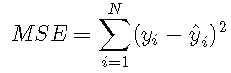
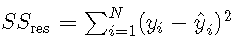
均方误差
均方误差由比较预测y ^ y ^与观察到的结果yy所得的残差平方和确定:

由于MSE是基于残差平方的,因此它取决于结果平方 。因此,MSE的根 通常用于报告模型拟合:
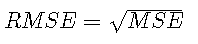

均方误差的一个缺点是它不是很容易解释,因为MSE取决于预测任务,因此无法在不同任务之间进行比较。例如,假设一个预测任务与估计卡车的重量有关,而另一项与估计苹果的重量有关。然后,在第一个任务中,好的模型可能具有100 kg的RMSE,而在第二个任务中,好的模型可能具有0.5 kg的RMSE。因此,虽然RMSE可用于模型选择,但很少报告,而使用R2R2。
皮尔逊相关系数
由于确定系数可以用皮尔逊相关系数来解释,因此我们将首先介绍该数量。令Y ^ Y ^表示模型估计,而YY表示观察到的结果。然后,相关系数定义为
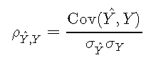
其中Cov(⋅,⋅)∈RCov(⋅,⋅)∈R是协方差,而σσ是标准偏差。协方差定义为
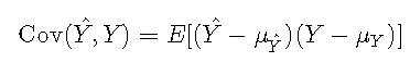

其中,μμ表示平均值。在离散设置中,可以将其计算为
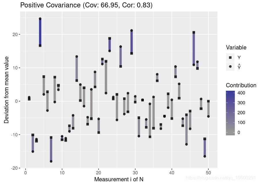
这意味着,如果预测和结果与平均值的偏差相似,则它们的协方差将为正;如果与平均值具有相对的偏差,则它们之间的协方差将为负。
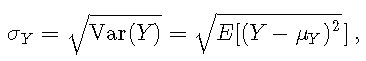
标准偏差定义为

在离散设置下,可以计算为
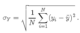


请注意,R函数 sd 计算总体标准差,该标准差用于获得无偏估计量。如果分布较宽(均值附近的宽分布),则σσ高;如果分布较窄(均值周围的较小分布),则σσ小。
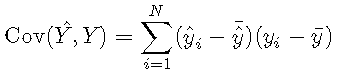
关联 :协方差和标准差
为了更好地理解协方差,我们创建了一个绘制测量值与均值偏差的函数:
plot.mean.deviation <- function(y, y.hat, label) {
    means <- c(mean(y), mean(y.hat))
    y.deviation <- y - mean(y)
    y.hat.deviation <- y.hat - mean(y.hat)
    prod <- y.deviation * y.hat.deviation

    pos.neg <- ifelse(sign(prod) >= 0, "Positive", "Negative")

    library(ggplot2)
    covariance <- round(cov(y, y.hat), 2)
    correlation <- round(cor(y, y.hat), 2)
    title <- paste0(label, " (Cov: ", covariance, ", Cor: ", correlation, ")")
    ggplot()
}
然后,我们生成代表三种协方差的数据:正协方差,负协方差和无协方差:
# covariance

library(gridExtra)
grid.arrange(p1, p2, p3, nrow = 3)

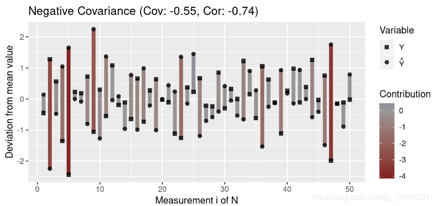

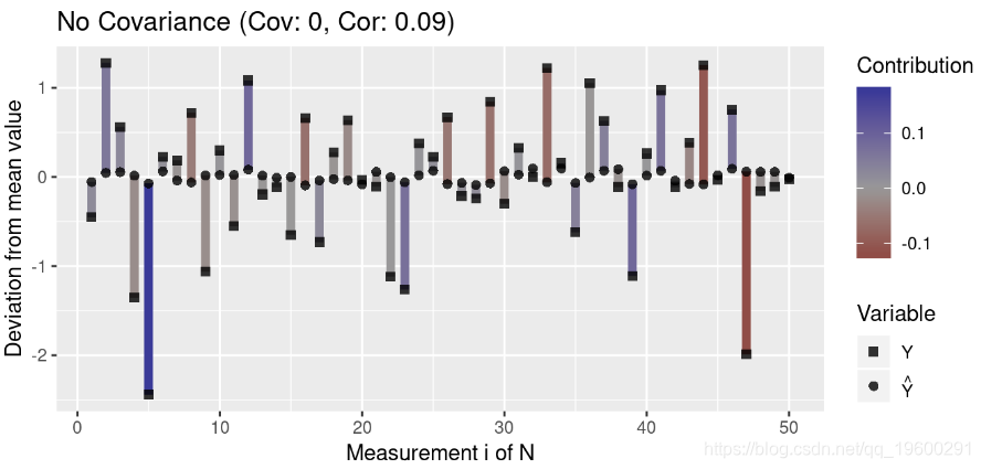

注意离群值(与均值的高偏差)对协方差的影响大于与均值接近的值。此外,请注意,协方差接近0表示变量之间在任何方向上似乎都没有关联(即各个贡献项被抵消了)。
由于协方差取决于数据的散布,因此具有高标准偏差的两个变量之间的绝对协方差通常高于具有低方差的变量之间的绝对协方差。让我们可视化此属性:
# high variance data

plot.mean.deviation(y, y.hat, label = "Positive Covariance")

df.high <- data.frame(Y = y, Y_Hat = y.hat)
因此,协方差本身不能得出关于两个变量的相关性的结论。这就是为什么Pearson的相关系数通过两个变量的标准偏差将协方差归一化的原因。由于这将相关性标准化到范围[-1,1] ,因此即使变量具有不同的方差,也可以使相关性具有可比性。值-1表示完全负相关,值1表示完全正相关,而值0表示没有相关。
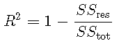
R2确定系数
确定系数R2 定义为


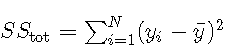


其中 是平方的残差和,是平方 的总和。对于模型选择,R2R2等效于RMSE,因为对于基于相同数据的模型,具有最小MSE的模型也将具有最大值 。
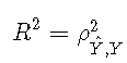
可以根据相关系数或根据解释的方差来解释确定系数。
用相关系数解释
R平方通常为正,因为具有截距的模型会产生SSres <SStotSSres <SStot的预测Y ^ Y ^,因为模型的预测比平均结果更接近结果。因此,只要存在截距,确定系数就是相关系数的平方:

用解释方差解释
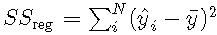

在平方总和分解为残差平方和回归平方和的情况下 ,

然后
这意味着R2 表示模型所解释的方差比。因此,R2 = 0.7R2 = 0.7的模型将解释70% 的方差,而剩下30% 的方差无法解释。
确定系数
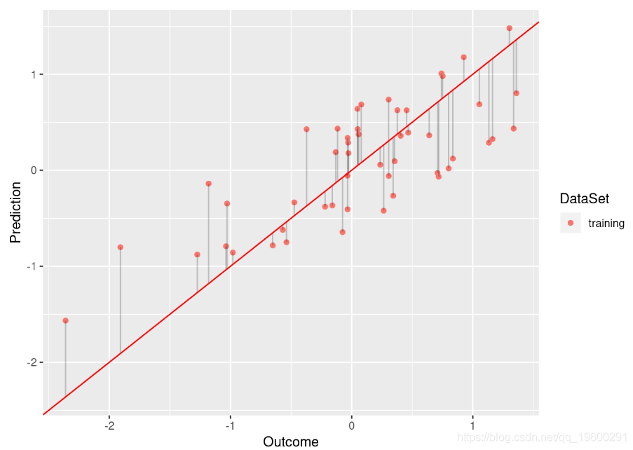
为了获得有关R2 ,我们定义了以下函数,利用它们可以绘制线性模型的拟合。理想模型将位于曲线的对角线上,并且将残差表示为与该对角线的偏差。
rsquared <- function(test.preds, test.labels) {
    return(round(cor(test.preds, test.labels)^2, 3))
}
plot.linear.model <- function(model, test.preds = NULL, test.labels = NULL,
                            test.only = FALSE) {

    if (!is.null(test.preds) && !is.null(test.labels)) {
        # store predicted points:
        test.df <- data.frame("Prediction" = test.preds,
                            "Outcome" = test.labels, "DataSet" = "test")
        # store residuals for predictions on the test data
        test.residuals <- test.labels - test.preds
        test.res.df <- data.frame("x" = test.labels, "y" = test.preds,
                        "x1" = test.labels, "y2" = test.preds + test.residuals,
                         "DataSet" = "test")
        # append to existing data
        plot.df <- rbind(plot.df, test.df)
        plot.res.df <- rbind(plot.res.df, test.res.df)
        # annotate model with R^2 value
        r.squared <- rsquared(test.preds, test.labels)
    }
    #######
    library(ggplot2)

        p <- p + annotate("text", x = x.pos, y = y.pos, label = label, size = 5)
    }
    return(p)
}
例如,比较以下模型
model <- lm(Y ~ Y_Hat, data = df.low)
plot.linear.model(model) 
model <- lm(Y ~ Y_Hat, data = df.no)
plot.linear.model(model)
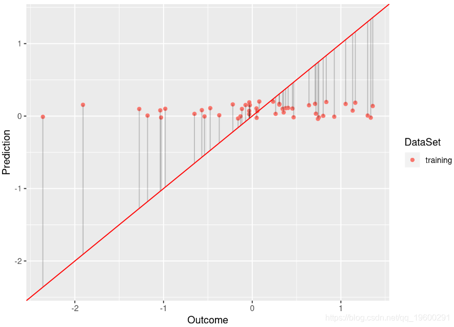

尽管基于的模型 df.low 具有足够的拟合度(R平方为0.584), df.low 但不能很好地拟合数据(R平方为0.009)。
R平方的局限性
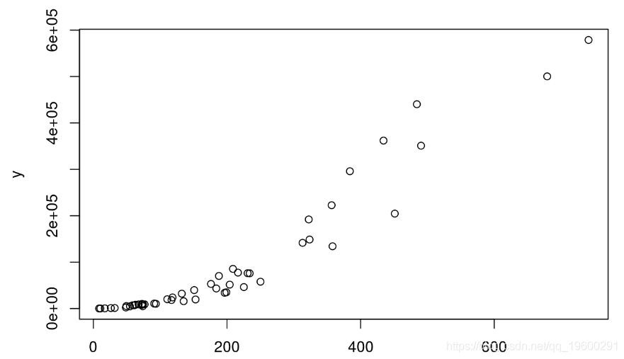
仅基于R平方盲目选择模型通常是个坏主意。首先,R平方不一定能告诉我们一些关于拟合优度的信息。例如,考虑具有指数分布的数据:
x <- rexp(50,rate=0.005)  # exponential
y <- (x + 2.5)^2 * runif(50, min=0.8, max=2) # non-linear relationship with x
plot(x,y) 

让我们为基于这些数据的线性模型计算R 2:
df <- data.frame("x" = x, "y" = y)
model <- lm(x ~ y, data = df)
print(round(summary(model)$r.squared, 2))
## [1] 0.9
如我们所见,R平方非常高。尽管如此,该模型仍无法很好地拟合,因为它不遵守数据的指数分布。
R2R2的另一个属性是它取决于值范围。R2R2通常在XX的宽值范围内较大,这是因为协方差的增加是由标准偏差调整的,该标准偏差的缩放速度比1N 项引起的协方差的缩放速度慢。
# wide value range:
x <- seq(1,10,length.out = 100)
y <- 2 + 1.2*x + rnorm(100,0,sd = 0.9)
model <- lm(y ~ x)
mse <- sum((fitted(model) - y)^2)/100
print(paste0("R squared: ", summary(model)$r.squared,
        ", MSE:", mse))
## [1] "R squared: 0.924115453794893, MSE:0.806898017781999"
# narrow value range
x <- seq(1,2,length.out = 100)
y <- 2 + 1.2*x + rnorm(100,0,sd = 0.9)
model <- lm(y ~ x)
mse <- sum((fitted(model) - y)^2)/100
print(paste0("R squared: ", summary(model)$r.squared,
        ", MSE:", mse))
## [1] "R squared: 0.0657969487417489, MSE:0.776376454723889"
我们可以看到,即使两个模型的残差平方和相似,第一个模型的R2 也更高。
分类模型的绩效指标
二进制分类的许多性能度量均依赖于混淆矩阵。假设有两个类别,00和11,其中11表示特征的存在(正类),00表示特征的不存在(负类)。相应的混淆矩阵是具有以下结构的2×22×2表:
| 预测/参考 | 0 | 1个 |
|---|---|---|
| 0 | TN | FN |
| 1个 | FP | TP |
其中TN表示真实否定的数量(模型正确预测否定类别),FN表示假否定的数量(模型错误地预测否定类别),FP表示错误肯定的数量(模型错误地预测肯定类别),TP表示真实阳性的数量(模型正确预测阳性类别)。
准确性与敏感性和特异性
基于混淆矩阵,可以计算准确性,敏感性(真阳性率,TPR)和特异性(1-假阳性率,FPR):

准确性表示正确预测的总体比率。准确性的声誉很差,因为如果类别标签不平衡,它就不合适。例如,假设您要预测稀有肿瘤的存在(1类)与不存在的罕见肿瘤(0类)。让我们假设只有10%的数据点属于肯定类别,而90%的数据属于正面类别。总是预测阴性分类(即未发现肿瘤)的分类器的准确性如何?这将是90%。但是,这可能不是一个非常有用的分类器。因此,灵敏度和特异性通常优于准确性。
敏感性表示正确预测的观察到的阳性结果的比率,而特异性表示与阳性分类相混淆的观察到的阴性结果的比率。这两个数量回答以下问题:
- 敏感性:如果事件发生,则模型检测到事件的可能性有多大?
- 特异性:如果没有事件发生,那么该模型识别出没有事件发生的可能性有多大?
我们始终需要同时考虑敏感性和特异性,因为这些数量本身对模型选择没有用。例如,始终预测阳性类别的模型将使灵敏度最大化,而始终预测阴性类别的模型将使特异性最大化。但是,第一个模型的特异性较低,而第二个模型的灵敏度较低。因此,敏感性和特异性可以解释为跷跷板,因为敏感性的增加通常导致特异性的降低,反之亦然。
通过计算平衡精度,可以将灵敏度和特异性合并为一个数量
平衡精度是更适合于类别不平衡的问题的度量。
ROC曲线下方的区域
评分分类器是为每个预测分配一个数值的分类器,可用作区分这两个类的临界值。例如,二进制支持向量机将为正类分配大于1的值,为负类分配小于-1的值。对于评分分类器,我们通常希望确定的模型性能不是针对单个临界值而是针对多个临界值。
这就是AUC(ROC曲线下方的区域)出现的位置。此数量表示在几个截止点的灵敏度和特异性之间进行权衡。这是因为接收器工作特性(ROC)曲线只是TPR与FPR的关系图,而AUC是由该曲线定义的面积,范围为[0,而AUC是由该曲线定义的面积,其中在[0,1]范围内。
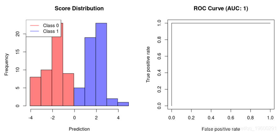
使用R,我们可以使用ROCR 包来计算AUC 。让我们首先创建一个用于绘制分类器及其AUC得分的函数:
plot.scores.AUC <- function(y, y.hat) {
    par(mfrow=c(1,2))
    hist(y.hat[y == 0], col=rgb(1,0,0,0.5),
         main = "Score Distribution",
         breaks=seq(min(y.hat),max(y.hat)+1, 1), xlab = "Prediction")

    # plot ROC curve

    plot(prf, main = paste0("ROC Curve (AUC: ", round(auc, 2), ")"))
}
# create binary labels

plot.scores.AUC(y, y.hat)
# create slightly overlapping Gaussians

plot.scores.AUC(y, y.hat)
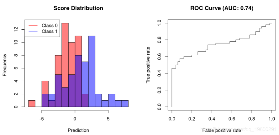

第一个示例显示允许完美分离的分类器的AUC为1。不能完全分离的分类器需要牺牲特异性以提高其灵敏度。因此,它们的AUC将小于1。
可下载资源
关于作者
Kaizong Ye是拓端研究室(TRL)的研究员。在此对他对本文所作的贡献表示诚挚感谢,他在上海财经大学完成了统计学专业的硕士学位,专注人工智能领域。擅长Python.Matlab仿真、视觉处理、神经网络、数据分析。
本文借鉴了作者最近为《R语言数据分析挖掘必知必会 》课堂做的准备。
非常感谢您阅读本文,如需帮助请联系我们!
 R语言广义加性模型GAM、Tweedie分布的SaaS客户生命周期价值CLV预测研究——非线性关系捕捉与异方差性适配创新|附代码数据
 R语言优化沪深股票投资组合:粒子群优化算法PSO、重要性采样、均值-方差模型、梯度下降法|附代码数据
 Python梯度提升树、XGBoost、LASSO回归、决策树、SVM、随机森林预测中国A股上市公司数据研发操纵融合CEO特质与公司特征及SHAP可解释性研究|附代码数据
 视频讲解|Stata和R语言自助法Bootstrap结合GARCH对sp500收益率数据分析