最近我们被客户要求撰写关于分析COVID-19的研究报告。本文用matlab分析COVID-19数据集。
我们检查解压缩的文件。包含:
- data.csv -2020年各省/州的全球病例每日水平数据
- confirmed.csv-确诊病例的时间序列数据
- deaths.csv-死亡人数的时间序列数据
- recovered.csv-康复人数的时间序列数据
可下载资源
地图上可视化
我们在地图上可视化已确诊病例的数量。我们首先加载纬度和经度变量。
opts = detectImportOptions(filenames(4), "TextType","string");
数据集包含“省/州”变量,但我们要在“国家/地区”等级汇总数据。在此之前,我们需要稍微整理一下数据。
times_conf.(
times_conf.("Country/Region")(times_conf.("Country/Region") == "Czechia") = "Czech Republic";
现在,我们可以使用 groupsummary 将已确认的案例相加并平均经纬度来按国家/地区汇总数据。
country = groupsummary(times_conf,"Country/Region",{'sum','mean'},vars(3:end));
输出中包含不必要的列,例如纬度和经度的总和。我们删除这些变量。
vars = regexprep(vars,"^(sum_)(?=L(a|o))","remove_");
vars = regexprep(vars,"^(mean_)(?=[0-9])","remove_");
times_conf_ = times_conf_country(times_conf_country.("Country/Region") ~= ",:);
让我们使用 geobubble 可视化数据集中的第一个和最后一个日期数据。
for ii = [4, length(vars)]
    times_conf_.Category = categorical(repmat("<100",height(times_conf_e),1));
    times_conf_.Category(table2array(times_conf_(:,ii)) >= 100) = ">=100";
    gb.LegendVisible = "off";
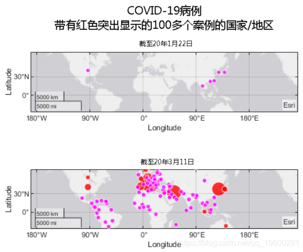
值得注意的是,我们早在2020年1月22日就已经在美国确认了病例。
美国确诊病例
进入美国的省/州级别。
figure
t = tiledlayout("flow");
for ii = [5, length(vars)]

    gb.BubbleColorList = [1,0,1;1,0,0];
    gb.LegendVisible = "off";
    gb.Title = "As of " + vars(ii);
    gb.SizeLimits = [0, max(times_conf_us.(vars{length(vars)}))];
    gb.MapCenter = [44.9669 -113.6201];
    gb.ZoomLevel = 1.7678;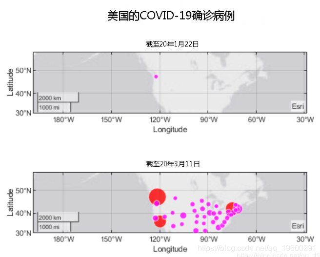
可以看到它始于华盛顿,并在加利福尼亚和纽约爆发了大规模疫情。
按确诊病例排名国家/地区
让我们使用covid_19_data.csv比较按国家/地区确认的病例数。日期时间格式中存在不一致之处,因此我们一开始会将其视为文本。
opts = detectImportOptions(filenames(3), "TextType","string","DatetimeType","text");
清理日期时间格式。
Data.nDate = regexprep(Data.Date,"\/20$","/2020");
Data.Date = datetime(Data.Date);
我们还需要标准化“国家/地区”中的值。

Country_Region(Country_Region == "Iran (Islamic Republic of)") = "Iran";
数据集包含省/州变量。让我们在“国家/地区”级别汇总数据。
countryData = groupsummary(provData,{'ObservationDate','Country_Region'}, ...
    "sum",{'Confirmed','Deaths','Recovered'});
countryData包含每日累积数据。我们只需要最新的数字。
确认病例按国家/地区的增长
我们还可以检查这些国家中病例的增长速度。
figure
plot(countryData.ObservationDate(countryData.Country_Region == labelsK(2)), ...
hold on
for ii = 3:length(labelsK)
    plot(countryData.ObservationDate(countryData.Country_Region == labelsK(ii)), ...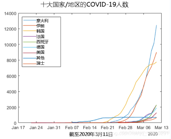
尽管韩国显示出增长放缓的迹象,但它在其他地方正在加速发展。
随时关注您喜欢的主题
按国家/地区划分的新病例增长
我们可以通过减去两个日期之间已确认病例的累计数量来计算新病例的数量。
for ii = 1:length(labelsK)
    country = provData(provData.Country_Region == labelsK(ii),:);
    country = groupsummary(country,{'ObservationDate','Country_Region'}, ...

    if labelsK(ii) ~= "Others"
        nexttile
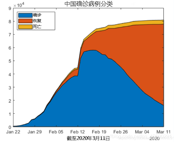
有效案例的数量正在下降,曲线看起来大致为高斯曲线。我们可以拟合高斯模型并预测活动案例何时为零吗?
ft = fittype("gauss1");

[fobj, gof] = fit(x,y,ft,opts);
gof
gof =
struct with fields:
sse: 4.4145e+08
rsquare: 0.9743
dfe: 47
adjrsquare: 0.9732
rmse: 3.0647e+03让我们通过增加20天来将输出预测。
现在我们对结果进行绘制。
figure
area(ObservationDate,by_country{1}.Active)
hold on
plot(xdates,yhat,"lineWidth",2)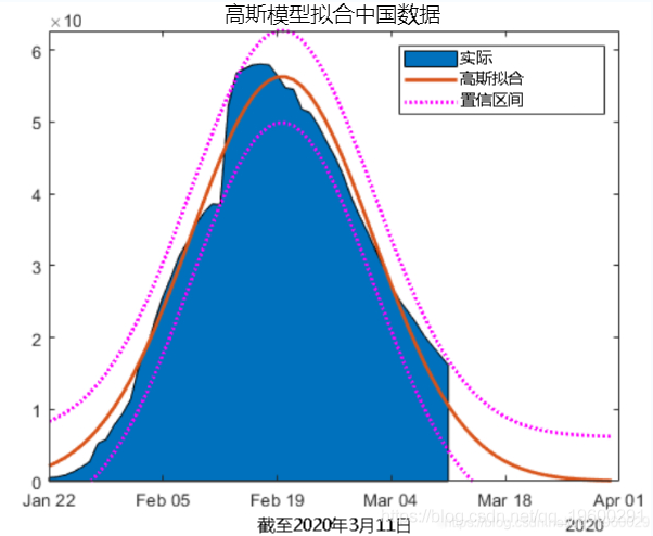
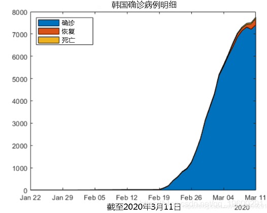
韩国
让我们来查看韩国的活跃病例,恢复案例和死亡人数。
使用高斯模型无法获得任何合适的结果。
可下载资源
关于作者
Kaizong Ye是拓端研究室(TRL)的研究员。在此对他对本文所作的贡献表示诚挚感谢,他在上海财经大学完成了统计学专业的硕士学位,专注人工智能领域。擅长Python.Matlab仿真、视觉处理、神经网络、数据分析。
本文借鉴了作者最近为《R语言数据分析挖掘必知必会 》课堂做的准备。
非常感谢您阅读本文,如需帮助请联系我们!
 MATLAB用CNN-LSTM神经网络的语音情感分类深度学习研究
 疫情期间航空网络演变复杂网络可视化
 上海、国际新冠疫情数据分析可视化
 Python对全球Covid-19疫情失业数据相关性、可视化分析