本文用爬虫采集了汽车销售数据,后来对其进行了扩展,创建这个数据集,其中包括境内的所有二手车辆或者经销商车辆条目数据。
这些数据每隔几个月就会被抓取一次,它包含 提供的关于汽车销售的大部分相关信息,包括价格、状况、制造商、纬度/经度和 18 个其他类别等列。对于机器学习ML 项目,请考虑对位置列(例如 long/lat)进行特征工程。
问题 #1 数据集中有多少个观测值?
数据分布图简介
中医上讲看病四诊法为:望闻问切。而数据分析师分析数据的过程也有点相似,我们需要望:看看数据长什么样;闻:仔细分析数据是否合理;问:针对前两步工作搜集到的问题与业务方交流;切:结合业务方反馈的结果和项目需求进行数据分析。
"望"的方法可以认为就是制作数据可视化图表的过程,而数据分布图无疑是非常能反映数据特征(用户症状)的。R语言提供了多种图表对数据分布进行描述,本文接下来将逐一讲解。
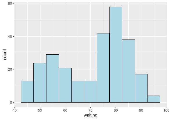
绘制基本直方图
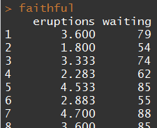
本例选用如下测试集:
直方图的横轴为绑定变量区间分隔的取值范围,纵轴则表示变量在不同变量区间上的频数。绘制时只需将基函数的美学特征集中配置好需要分析的变量,然后创建新的直方图图层即可。R语言示例代码如下:
|
1 2 3 4 |
# 基函数 ggplot(faithful, aes(x = waiting)) + # 直方图函数:binwidth设置组距 geom_histogram(binwidth = 5, fill = "lightblue", colour = "black") |
基于分组的直方图
本例选用如下测试集:

直方图的分组图和本系列前面一些博文中讲的一些分组图不同,它不能进行水平方向的堆积 – 这样看不出频数变化趋势;也不能进行垂直方向的堆积 – 这样同样看不出趋势。这里采用一种新的堆积方法:重叠堆积,R语言实现代码如下:
|
1 2 3 4 5 6 7 |
# 预处理:将smoke变量转换为因子类型 birthwt$smoke = factor(birthwt$smoke)
# 基函数:x设置目标变量 ggplot(birthwt, aes(x = bwt, fill = smoke)) + # 直方图函数:position设置堆积模式为重叠 geom_histogram(position = "identity", alpha = 0.4) |

也可以采用分面的方法,R语言实现代码如下:
|
1 2 3 4 5 6 7 8 9 10 11 |
# 预处理1:将smoke变量转换为因子类型 birthwt$smoke = factor(birthwt$smoke) # 预处理2:改变因子水平名称 birthwt$smoke = revalue(birthwt$smoke, c("0" = "No Smoke", "1" = "Smoke"))
# 基函数 ggplot(birthwt, aes(x = bwt)) + # 直方图函数 geom_histogram(fill = "lightblue", colour = "black") + # 分面函数:纵向分面 facet_grid(smoke ~ .) |

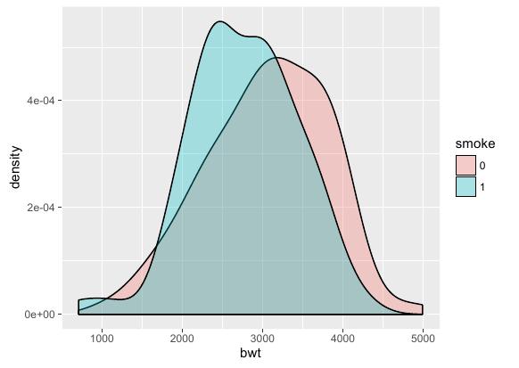
绘制密度曲线
本例选用如下测试集:
密度曲线表达的意思和直方图很相似,因此密度曲线的绘制方法和直方图也几乎是相同的。区别仅在于密度曲线的横轴要绑定到连续型变量,另外绘制函数的名字不同。R语言示例代码如下:
|
1 2 3 4 5 6 7 |
# 预处理:将smoke变量转换为因子类型 birthwt$smoke = factor(birthwt$smoke)
# 基函数:x设置目标变量,fill设置填充色 ggplot(birthwt, aes(x = bwt, fill = smoke)) + # 密度曲线函数:alpha设置填充色透明度 geom_density(alpha = 0.3) |
绘制基本箱线图
本例选用如下测试集:
箱线图是一种常用数据分布图,下图表示了这种图中各元素的意义:
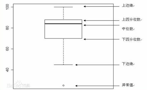
绘制方法是在基函数中将变量分组绑定到横轴,变量本身绑定到纵轴。此外,为了美观也可以将分组绑定到fill变量并设置调色板。R语言示例代码如下:
|
1 2 3 4 5 6 |
# 基函数 ggplot(birthwt, aes(x = factor(race), y = bwt, fill = factor(race))) + # 箱线图函数 geom_boxplot() + # 颜色标尺 scale_fill_brewer(palette = "Pastel2") |

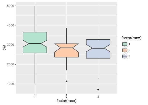
往箱线图添加槽口和均值
在上一节绘制的基本箱线图之上,还能进一步绘制以展示更多信息。
其中最常见的是为箱子添加槽口,它能更清晰的表示中位数的位置。R语言实现代码如下:
|
1 2 3 4 5 6 |
# 基函数 ggplot(birthwt, aes(x = factor(race), y = bwt, fill = factor(race))) + # 箱线图函数 geom_boxplot(notch = TRUE) + # 颜色标尺 scale_fill_brewer(palette = "Pastel2") |
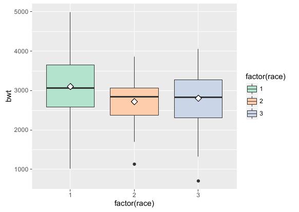
通过stat_summary()函数,还可以在箱线图中标记均值点。R语言实现代码如下:
|
1 2 3 4 5 6 |
# 基函数 ggplot(birthwt, aes(x = factor(race), y = bwt, fill = factor(race))) + # 箱线图函数 geom_boxplot(notch = TRUE) + # 颜色标尺 scale_fill_brewer(palette = "Pastel2") |
绘制2D等高线
本例选用如下测试集:
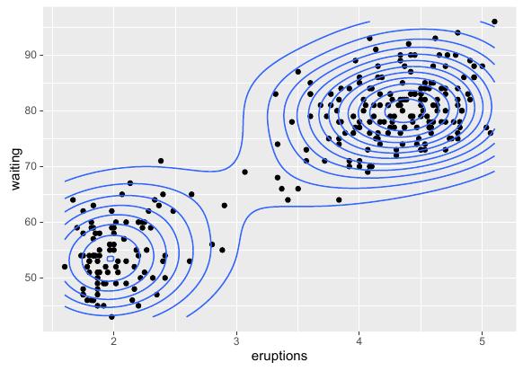
绘制2D等高线主要是调用stat_density()函数。这个函数会给出一个基于数据的二维核密度估计,然后我们可基于这个估计值来判断各样本点的"等高"性。接下来首先给出各数据点及等高线的绘制方法,R语言实现代码如下:
|
1 2 3 4 5 6 |
# 基函数 ggplot(faithful, aes(x = eruptions, y = waiting)) + # 散点图函数 geom_point() + # 密度图函数 stat_density2d() |
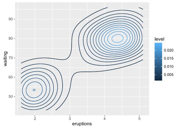
也可以通过设置密度函数美学特征集中的colour参数来给不同密度的等高线着色,R语言实现代码如下:
|
1 2 3 4 |
# 基函数 ggplot(faithful, aes(x = eruptions, y = waiting)) + # 密度图函数:colour设置等高线颜色 stat_density2d(aes(colour = ..level..)) |
绘制2D密度图
本例选用如下测试集:
等高线图也是密度图的一种,因此绘制密度图和等高线图用的是同一个函数:stat_density(),只是它们传入的参数不同。首先绘制经典栅格密度图,R语言实现代码如下:
|
1 2 3 4 |
# 基函数 ggplot(faithful, aes(x = eruptions, y = waiting)) + # 密度图函数:fill设置填充颜色数据为密度,geom设置绘制栅格图 stat_density2d(aes(fill = ..density..), geom = "raster", contour = FALSE) |

也可以将密度变量映射到透明度来渲染,R语言实现代码如下:
|
1 2 3 4 5 |
ggplot(faithful, aes(x = eruptions, y = waiting)) + # 散点图函数 geom_point() + # 密度图函数:alpha设置填充透明度数据为密度,geom设置绘制栅格图 stat_density2d(aes(alpha = ..density..), geom = "raster", contour = FALSE) |
# 我们可以通过计算行的数量来获得观察值的数量
## \[1\] 34677
# 另外,我们可以得到数据集,并查看行数(观察值)。

dim(vposts)

## \[1\] 34677    27
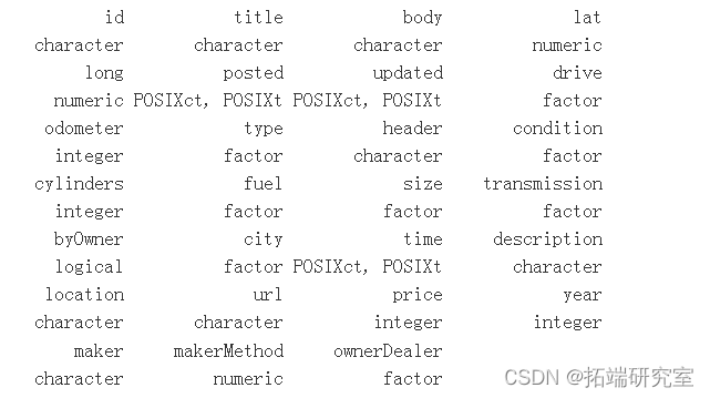
问题 #2 变量的名称是什么?每个变量的类别是什么?
unist sply(X  vposs, FUN = las) )


prit.able( sply(X = vosts, FUN clss) )
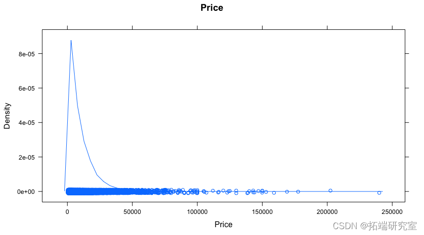
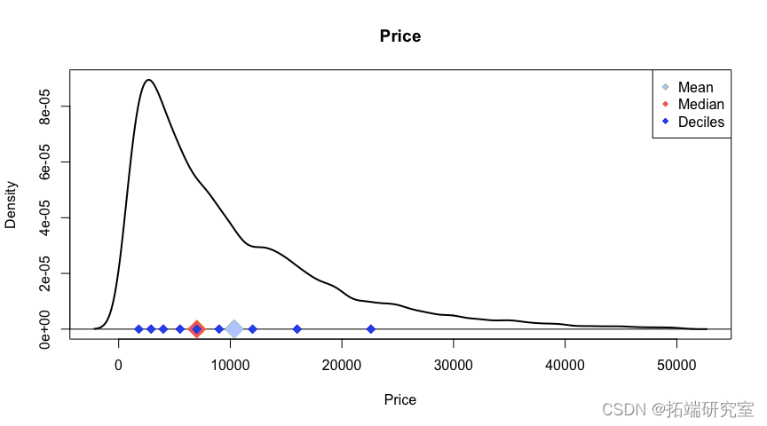
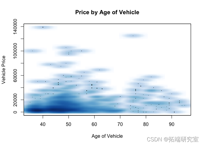
问题 #3 所有车辆的平均价格是多少?中间价?和十分位数?在车辆价格分布图上显示这些。
让我们先来看看这个问题的一些数据探索过程。
denstyplot(osts$pice, min = "rice", xlab = Prie")
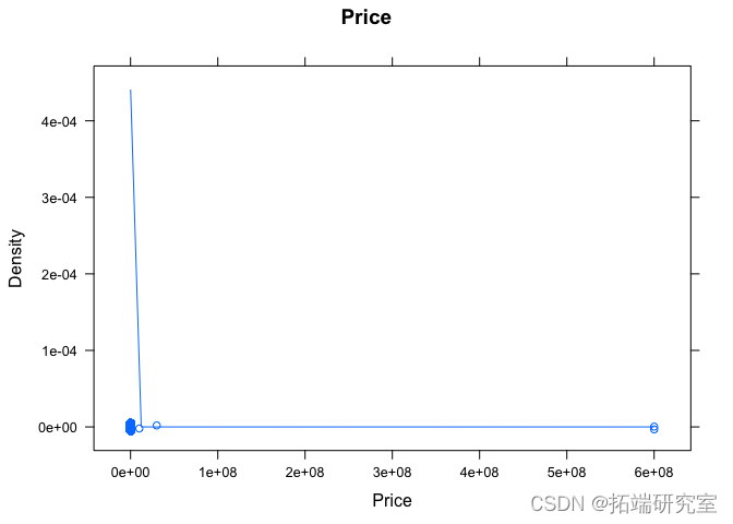

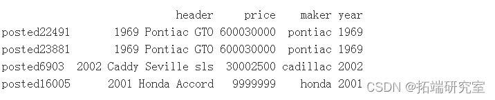
# 可以肯定的是,9999999 30002500 600030000 600030000的价格是非常可疑的。

# 让我们看看任何超过100,000的汽车。

idx =which( vpss$price >=  100000 & !is.na(vpst$price) )

legt( idx )

idx = idx\[de(vpsts\[ idx, "price"\])\]


vos\[ idx, c(headr", "prce") \]
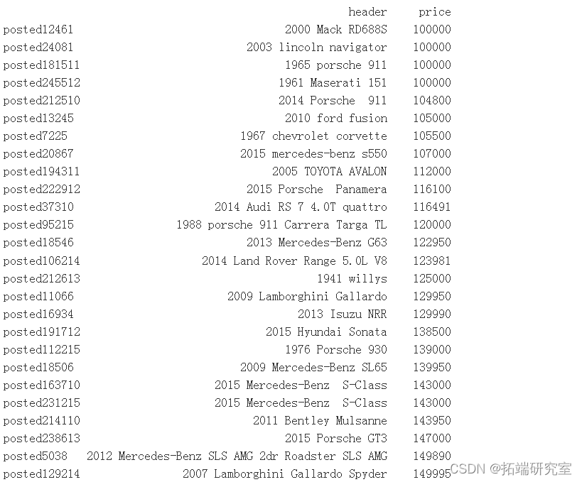

有一些非常昂贵的汽车,例如梅赛德斯-奔驰 G63 AMG、宾利慕尚、玛莎拉蒂 3500 GT、保时捷 GT 等。
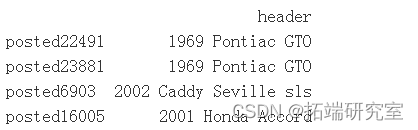
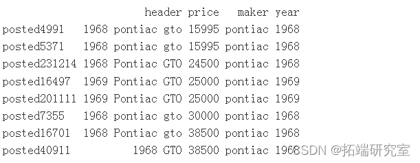
价格为 600030000 的两条记录是 1968 年和 1969 年的 Pontiac GTO – 600030000 美元,从阅读帖子正文可以看出,这些记录是在 6,000 美元到 30,000 美元之间定制 GTO 的报价。
随时关注您喜欢的主题
价格为 9999999 的 2001 年本田雅阁看起来像是发布广告的人故意误导的价格,因为他们未能填写其他几个字段。
也有很多汽车以 1 元的价格出售。这是以最低价格发布的常见广告策略,因为大多数人将价格从最低到最高排序,因此这些广告更频繁地出现在顶部。其中大部分是经销商的误导性广告,一些是汽车零部件,一些是汽车融资的报价。这里有太多数据需要手动清理,所以我们将它们排除在外。
idx = which( post$ri == 1 & !is.na(vpostspce) )

idx = smple(x = dx, size = 60, replace = FALSE)


denstyplotvpots$pice\[ idx )
quantle(x = ve, probs = c(0.05,0.99), na.rm = TRUE)
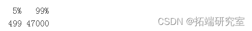
dec = quantile(x = vposce\[ idx \], probs = seq(from = 0.1, to = 0.9, by = 0.1) )


plot(density(vpss$pce\[ idx \])
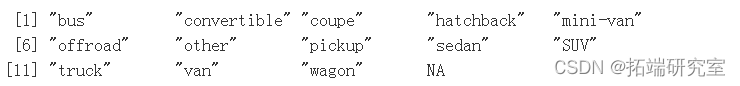
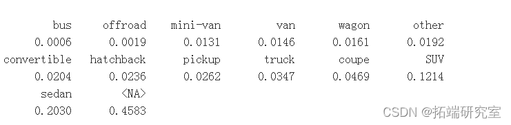
问题#4 有哪些不同类别的车辆,即类型变量/列?每个类别的比例是多少?
nams( table(vpoype, useNA = "ifany") )
ort( rond( x = prop.tbl( x = tae(vpst$type,eNA = "ifany") ),digis = 4) )
dott(x = sort(t), xlim = c(-0.05, 1.05), cex = 1.5)

t = prole( x = table(ts$type\[ !is.(vposs$type) \], usNA = "ifany") )

dolot(x
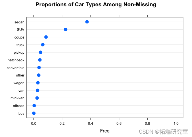
接近一半的数据缺少车辆类型。
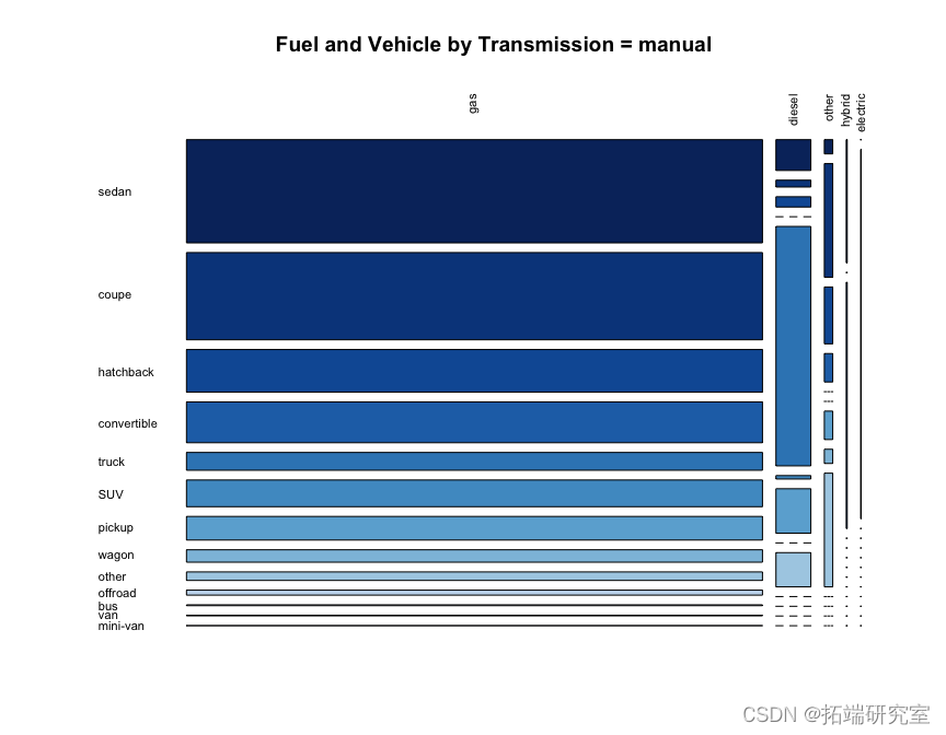
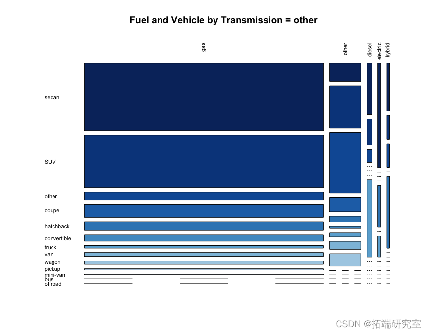
问题#5 显示燃料类型和车辆类型之间的关系。这取决于变速类型吗?
我们可以从下面的整体马赛克图中看到,按变速箱类型,汽油车辆在车辆类型和变速箱类型中占主导地位,但值得注意的是卡车的柴油百分比高于其他车辆类型,以及带有自动档的公共汽车。
在点图中看到这些相同的关系可能比在马赛克图中更容易看到。
tbl = tbl\[ rw.orde, col.order \]


maicpot(tbl
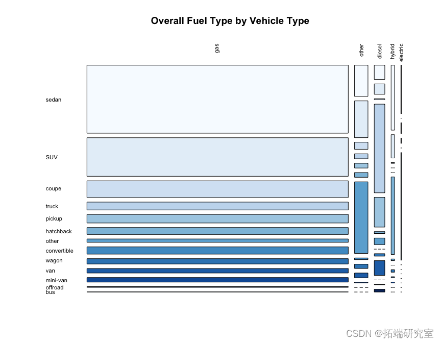
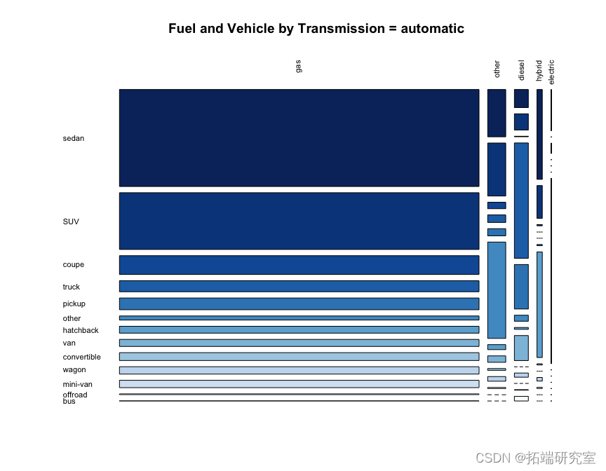
dotplot(

  prop.tabl
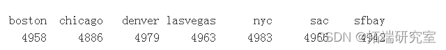
问题 #6 数据集中代表了多少个不同的城市?
length( levels(vpcity) )

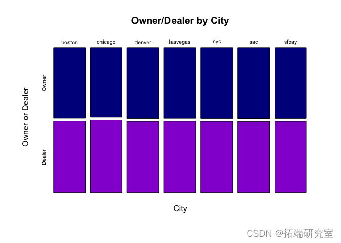
问题 #7 直观地展示“车主出售”和“经销商出售”的数量/比例在不同城市之间的差异?
有点可疑的是,所有城市都有大约 5000 个观测值,并且每个城市内的百分比几乎是完美的 50/50。
请注意,我们还在设置部分创建了一个新变量ownerDealer。
table(vpoity)
prop.table(taler, vposrgin = 2)
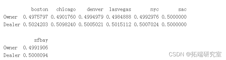
plot( table(vpostty, vporDealer, u
plot( prtable(table(vpoststy
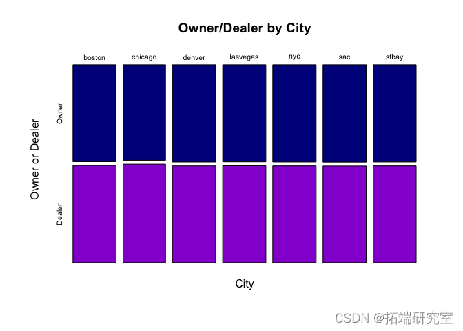
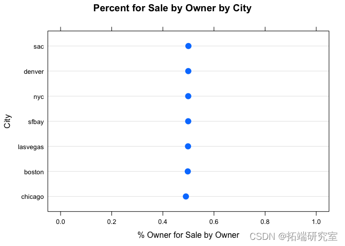
条形图基本上显示了关键信息。由于我们对每个城市内所有者的待售百分比感兴趣,因此点图可能最能观察到这一点。
我们可以从表格和图表中非常清楚地看到,车主发帖和经销商发帖的百分比几乎是完美的 50/50,而且在不同城市之间似乎根本没有差异。
问题 #8 在这个数据集中,一辆车的最高价格是多少?检查这一点并修复该值。现在检查价格的新最高值。
我们在上面的问题 3 中看到,价格数据存在很多问题。
# 让我们使用一个四舍五入的平均价格

nwPice = rund( man(osts$prie\[ix\]), digits = -3)


# 让我们看看我们是否能从数据集本身找到一个合适的点估计。

idx = ( voss$maer == adillac" & vpots$yar%in% c(2002) &

          vpts$price < 999999 &vpostspric > .case = TRUE) &
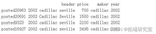
# 平均价格估计低于2500美元或3000美元的发布价格,因此使用较低的2500美元

roud( meanvpots$prie\[id\]), diits = -3)

还有更多需要修复的地方。
问题 #9 每个城市“车主销售”和“经销商销售”最常见的三种汽车品牌是什么?它们是相似的还是完全不同的?
cities = levels(vposts$city)


# 我们可以在一行中完成内部函数,但它很难读懂,所以把它分成几个步骤。


#      names( head( sort( table(vposts$maker\[ vposts$city == x & vposts$byOwner == y & sing = TRUE), 3) )

makeByCityByOwner = lapply(X = c(TRUE, FALSE), FUN = function(y){


})


names(makeByCityByOwner) = c("Owner", "Dealer")


makeByCityByOwner

# 按业主和经销商检查每个城市的顶部是否匹配

makeByyOwner$Owner\[ 1, \] == makeByOwner$Dealer\[ 1, \]

按城市出售的前 3 名中,有 2 名按所有者出售的产品在同一城市内的经销商出售的前 3 名中。每个城市的车主排名与除 SacTown 之外的所有城市的经销商排名相同。
问题 #10 直观地比较不同城市的车龄分布以及“车主销售”和“经销商销售”。提供对图的解释,即关键结论和见解是什么?
2022 年的本田奥德赛“只有 117102 英里”,所以这可能是 2002 年的拼写错误,所以让我们这样修复它。
年份 = 4 的 Jeep 可能是 2004 年,因为它有一个“AM/FM 盒式磁带播放器-muli CD 播放器”。
vpyear\[ vpyear == 2022 & !is.na(vpstsyer) \] = 2002

vposts = osts\[ -which(pstsyar == 1900 & !is.na(vpotar)), \]

vpotsyar\[ vposear == 4 & !is.na(vpose) \] = 2004


vpossage = 2016 - vpyear


histrm( ~ age | byOwn)
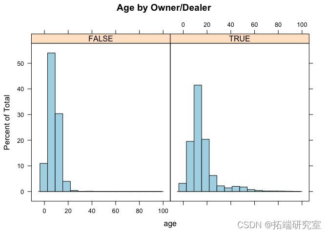
ix = ( vpsts$g < 25 & !is.na(vostge))


hitoram( ~ age | byOwne
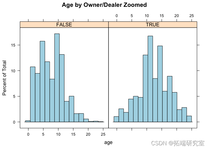
# 按城市来看,不同城市的车主与经销商根本没有太大的区别。

histogram( ~ age | byOwner + city,
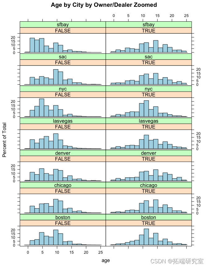
似乎车主出售的汽车往往比经销商出售的汽车年份更老。但是,这似乎因城市而异。
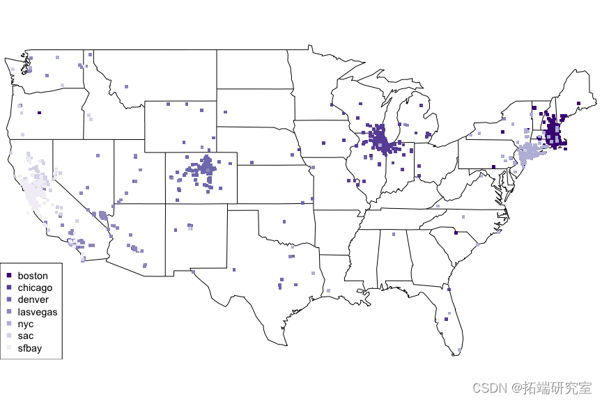
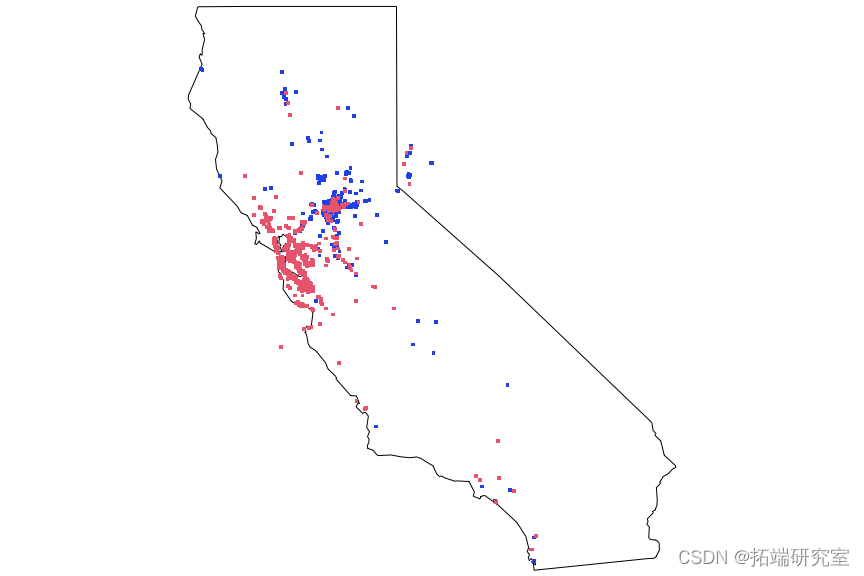
问题 #11 在地图上标出帖子的位置?你注意到了什么?
我们可以得出结论,在这些主要城市出售二手车的人(和/或汽车本身)的位置往往相当紧密地聚集在主要城市周围。
对于远离主要城市之一的地点,可能有多种解释。例如,当他们实际发布广告时,他们可能正在旅行。但总的来说,发布汽车的人的位置通常与他们试图出售车辆的城市相同。
我们可以通过使用 alpha 参数来控制绘图点的透明度,从而更好地查看密度和渗入其他区域的情况,从而对该图进行进一步改进。
map('state', mar = c(0,0,0,0))

invisible(

  lapply( 1:le col.palette\[x\]  )

        }

  )

)

legend("bottch = 15, cex = 0.9)
points(x = loionByCity\[\[ "sac" \]\]$lette\[1\] )


points(x = locationBy\[\[ "sfbay" \]\]$l5\] )
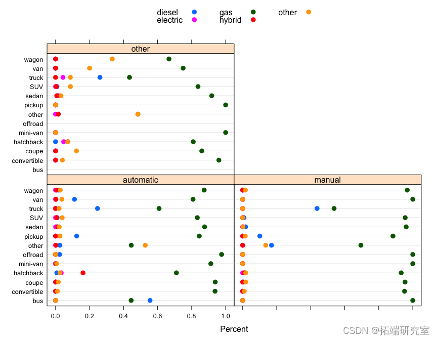
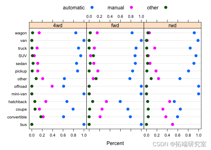
问题 #12 总结燃料类型、驱动和车辆类型的分布。
请注意,在下面的点图中,不同面板中的分布几乎相同,但分布在中间列中显示出一些变化,其中fuel type = "gas". 因此,我们基本上可以将燃料类型从图中删除,子集只fuel type = "gas"考虑其余三个变量之间的关系。
dotplot( table(vpossts$drive, vposransmission, vpo$type))


dotplot( tasts$type,sts$uel,vpos$drive, vpostrnsmission,

         auto.key = list(co )
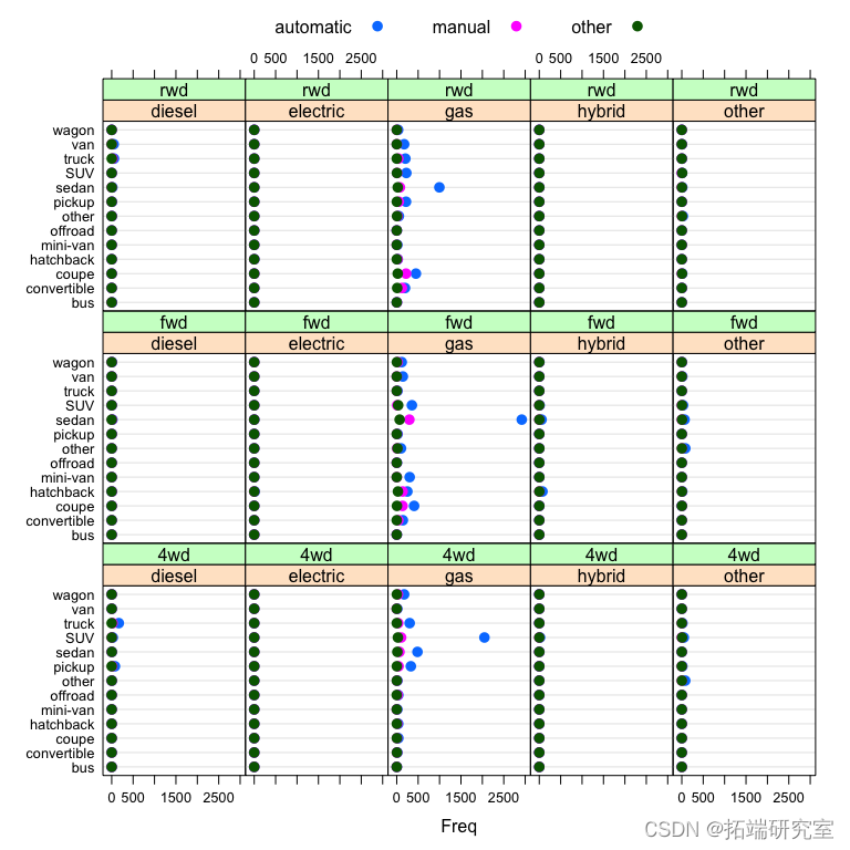
# 对于几乎所有的数据,燃料=汽油。

table(vposts$fuel, useNA = "ifany")
我们看到自动档 fuel == "gas"在所有类型的汽车中最常见,其次是手动。在后轮驱动车辆中,手动档比例确实高于轿跑车和敞篷车的其他车型,这是有道理的,因为轿跑车和敞篷车往往是跑车。在四轮驱动中,越野车比例更高。
dotplot(

  prop.table( table(vposts$ty
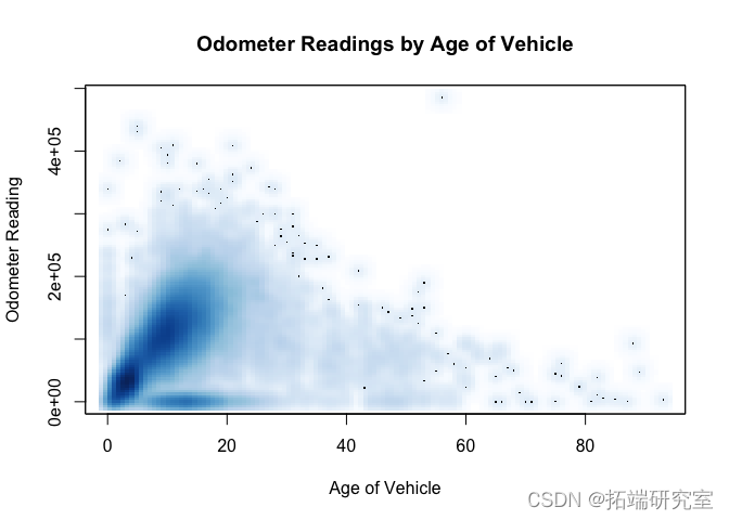
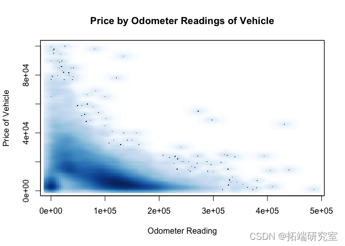
问题 #13 里程表读数和车龄有关系吗?里程表读数和价格?解释结果。里程表读数和车龄有关吗?
我们应该花一些时间清理里程表读数。例如,最大里程表读数 1234567890 只是一些广告。但是为了简单起见,我们看到里程表读数的第 99 个百分位数是 2.610^{5},因此我们将在 500,000 处修剪数据获得几乎所有分布。
绝大多数数据似乎确实呈上升趋势。但是,请注意大约 5 岁到 20 岁之间的浓密阴影,它们的里程表读数较低。
quantile(vpoter, probs = 0.99, na.rm = TRUE)
正如我们在下面的平滑散点图中看到的,里程表读数与价格之间普遍存在负相关关系,但请注意,有些非常昂贵的汽车里程表读数较低,其中许多是古董车。
idx = ( vpots$meter < 500000 & vpsts$ice >= 500 & vposice <= 100000 &

          !is.na(vposdometer) & !is.na(vposprice) )

smoothScatte
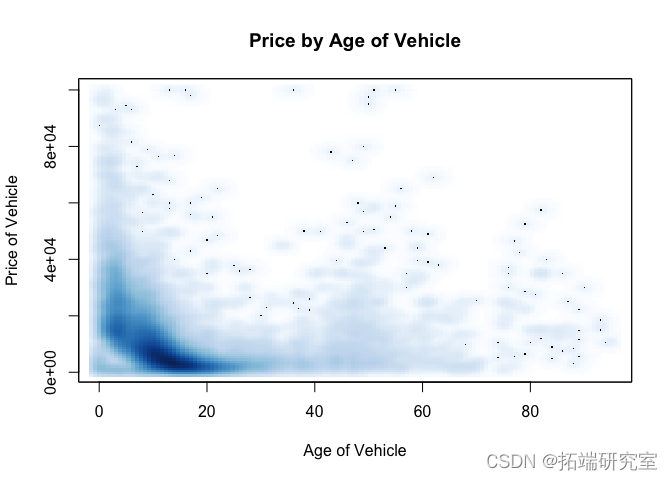
问题 #14 识别“老爷”车。这些是什么厂家生产的?这些的价格分布是什么?
从下面的第一个 smoothScatter 图中,超过 35 年的汽车是“老爷车”。
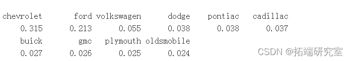
从下表中可以看出,雪佛兰和福特占“老爷车”的 50% 以上。特别是,由于美国直到 1970 年代石油危机才开始大规模进口日本汽车,因此日本“老爷车”并不多,而我们对“老爷车”的截止时间约为 1970 年。
比较“老爷车”与所有汽车的价格分布,“老爷车”似乎密度更高,价格更高,大部分价格低于 40,000 美元,而整体数据的大部分往往低于 20,000 美元。
idx = (vpts$prie >= 500 & vpos$rce <= 100000 &

          !is.na(vpsts$rice)  !is.na(vpoge) )


smootScater(x = vpst$ge\[idx\], y = vpoce\[ix\]
# 看看制造商和 老爷车的价格分布情况

idx = (vpoage >= 35 & !is.na(vpst$ge))
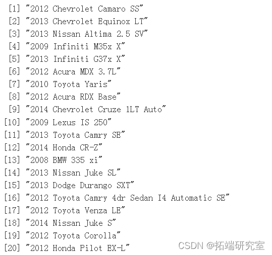
问题 #15 我省略了这个数据集中的一个重要变量。你认为那是什么?我们可以从其他变量中得出这个吗?
在网站上搜索汽车时,通常是年份、品牌和型号,按顺序排列。请注意,年份和品牌(即制造商)是数据集中的独立变量。但是,请注意数据集中调用的变量是 year、make 和 model。因此,如果我们可以解析每个标题的文本字符串以提取模型,我们可以为模型导出我们自己的独立变量。
head(vposts$header, 20)
问题 #16 显示使用情况和里程表是如何相关的。还有使用情况和价格是如何相关的。以及汽车的状况和年龄。简要解释您的发现。
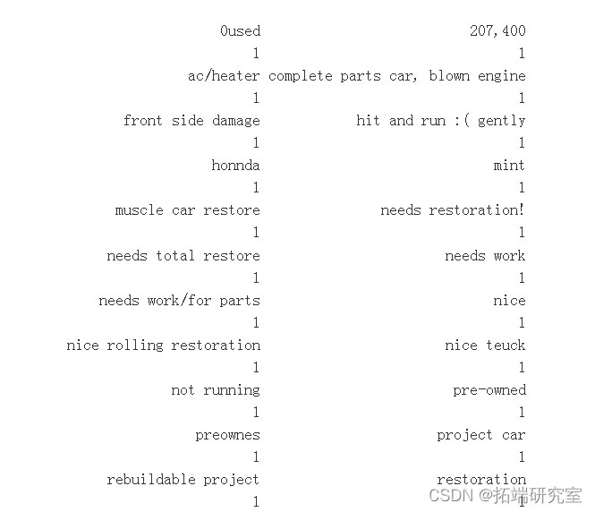
conditos = leels(vpsts$conitio)

conditon= sprintf('"%s",\\n', conditions)

 cat(conditions)
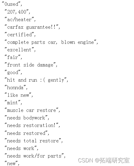
# 我们将以最常见的现有类别为基础建立新的类别。

sort(tble(vpst$coition))
vposts$

sane_odo = subst

boxplot(odoution bb = "Miles")
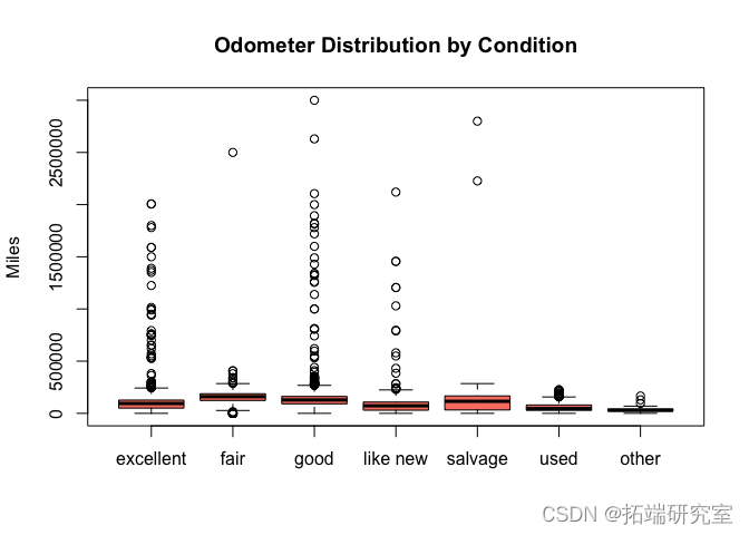
# 做第二张图,以更好地显示分布情况。

boxlotoistuiles")
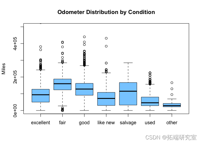
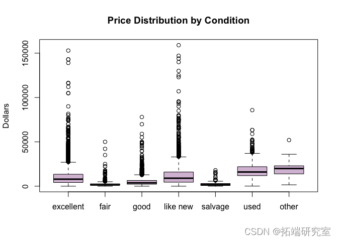
# 现在我们可以看到,最高的里程表读数似乎是在 "一般 "和 "良好 "条件下,这有点令人惊讶。有可能人们在里程表较高时夸大了车况,试图让它听起来更吸引人。车况分布最分散的是 "残次品",这是有道理的,因为残次品汽车可能非常旧,也可能是被损坏的新汽车。


san_rice = suset(vpsts,pric < 2e5)

pice\_y\_cond =split(sane\_prce$prce, san\_pricew_cond)

boxplo(price\_b\_con, co
age\_y\_cod = spli(sane\_ae$age, sae\_age$new_cond)

boxplot(age\_by\_cond, col = "
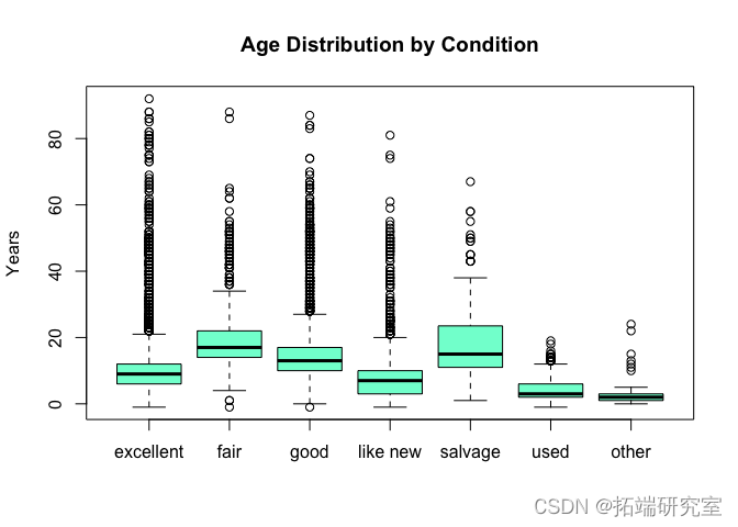
价格和车龄分布并没有显示出任何太令人惊讶的地方。 价格和状况似乎直接相关。 “像新”的汽车有时会以极高的价格提供,而这在状况较差的汽车中并不常见。车龄和状况成反比:旧车的状况似乎更糟。
自测题
Question #1 How many observations are there in the data set?
Question #2 What are the names of the variables? and what is the class of each variable?
Question #3 What is the average price of all the vehicles? the median price? and the deciles? Displays these on a plot of the distribution of vehicle prices.
Question #4 What are the different categories of vehicles, i.e. the type variable/column? What is the proportion for each category ?
Question #5 Display the relationship between fuel type and vehicle type. Does this depend on transmission type?
Question #6 How many different cities are represented in the dataset?
Question #7 Visually display how the number/proportion of “for sale by owner” and “for sale by dealer” varies across city?
Question #8 What is the largest price for a vehicle in this data set? Examine this and fix the value. Now examine the new highest value for price.
Question #9 What are the three most common makes of cars in each city for “sale by owner” and for “sale by dealer”? Are they similar or quite different?
Question #10 Visually compare the distribution of the age of cars for different cities and for “sale by owner” and “sale by dealer”. Provide an interpretation of the plots, i.e., what are the key conclusions and insights?
Question #11 Plot the locations of the posts on a map? What do you notice?
Question #12 Summarize the distribution of fuel type, drive, transmission, and vehicle type. Find a good way to display this information.
Question #13 Plot odometer reading and age of car? Is there a relationship? Similarly, plot odometer reading and price? Interpret the result(s). Are odometer reading and age of car related?
Question #14 Identify the “old” cars. What manufacturers made these? What is the price distribution for these?
Question #15 I have omitted one important variable in this data set. What do you think it is? Can we derive this from the other variables? If so, sketch possible ideas as to how we would compute this variable.
Question #16 Display how condition and odometer are related. Also how condition and price are related. And condition and age of the car. Provide a brief interpretation of what you find.
posts by people selling vehicles. The important variable that I did not give you was the model/type of the vehicle being sold. This is very important for determining the price of the vehicle. For example, a new Volve V60 has a suggested price of $35,000, but a new S60 has a price of $43,000, and the new Toyota Yaris and Avalon are $15,000 and $32,000 respectively – a factor of 2. So we need to determine the model of the vehicle.
We also want to verify some of the data and fix it if possible. And we also want to be able to programmatically extract other information from the posts if it is present.
- Extract the price being asked for the vehicle from the body column, if it is present, and check if it agrees with the actual price in the pricecolumn.
- Extract a Vehicle Identication Number (VIN) from the body, if it is present. We could use this to both identify details of the car (year it was built, type and model of the car, safety features, body style, engine type, etc.) and also use it to get historical information about the particular car. Add the VIN, if available, to the data frame. How many postings include the VIN?
- Extract phone numbers from the body column, and again add these as a new column. How many posts include a phone number?
- Extract email addresses from the body column, and again add these as a new column. How many posts include an email address?
- Find the year in the description or body and compare it with the value in the year column.
- Determine the model of the car, e.g., S60, Boxter, Cayman, 911, Jetta. This includes correcting mis-spelled or abbreviated model names. You may find the agrep() function useful. You should also use statistics, i.e., counts to see how often a word occurs in other posts and if such a spelling is reasonable, and whether this model name has been seen with that maker often.
When doing these questions, you will very likely have to iterate by developing a regular expression, and seeing what results it gives you and adapting it. Furthermore, you will probably have to use two or more strategies when looing for a particular piece of information. This is expected; the data are not nice and regularly formatted.
Modeling
Pick two models of cars, each for a different car maker, e.g., Toyota or Volvo. For each of these, separately explore the relationship between the price being asked for the vehicle, the number of miles (odometer), age of the car and condition. Does location (city) have an effect on this? Use a statistical model to be able to suggest the appropriate price for such a car given its age, mileage, and condition. You might consider a linear model, k-nearest neighbors, or a regression tree.
You need to describe why the method you chose is appropriate? what assumptions are needed and how reasonable they are? and how well if performs and how you determined this? Would you use it if you were buying or selling this type of car?
Useful Functions
strsplit(), grep(), grepl(), gregexpr(), sub(), gsub().
agrep(), adist(), nchar(), substring()
The stringi and stringr packages.
可下载资源
关于作者
Kaizong Ye是拓端研究室(TRL)的研究员。在此对他对本文所作的贡献表示诚挚感谢,他在上海财经大学完成了统计学专业的硕士学位,专注人工智能领域。擅长Python.Matlab仿真、视觉处理、神经网络、数据分析。
本文借鉴了作者最近为《R语言数据分析挖掘必知必会 》课堂做的准备。
非常感谢您阅读本文,如需帮助请联系我们!
 【专题】中国纯电新能源汽车-市场发展和用车报告2024年报告合集PDF分享(附原数据表)
 【专题】2024中国汽车业人工智能行业应用发展图谱报告合集PDF分享(附原数据表)
 R语言逻辑回归logistic模型ROC曲线可视化分析2例:麻醉剂用量影响、汽车购买行为
 R语言拟合线性混合效应模型、固定效应、随机效应参数估计可视化生物生长、发育、繁殖影响因素